Sunday, May 12, 2013

Reflection

Well dang I wish I had taken a picture of one of my last ones, but here's  a rather awful photo I took of my stuff at the show.

Dear Future AP Student,

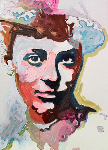
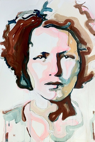
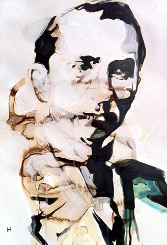
The pieces that I love the most that I did this year are the ones I thought about the least. For some people, I think not thinking enough about the decisions of why you're making a certain piece of art a certain way is really debilitating to how much you let yourself really get into your work...at the same time, for me, I think Mark Twain's idea that great writing is allowing your conscious self to get out of the way of your unconscious self applies to how I need to do my art more. 

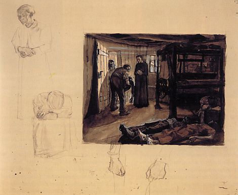
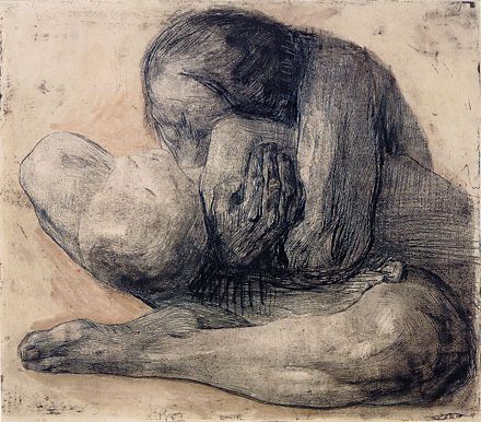
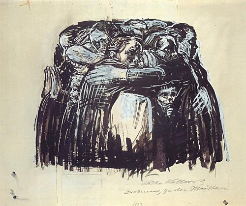
I started my year with a very conceptual idea, the whole "what boxes us" that I tried too hard to translate with literal images. And I hated the try-hard-ness of them. Everything I did felt like an ending point instead of a starting one. So if anything, my advice to myself and to future AP students is not to get so worked up about the idea of your concentration. Karen Shea made hers about fish--but man how sick are fish, and how much meaning you can put behind them... Sophie did squished-up body parts, but for the viewer, you see so much more... One time over the summer at an art show this kid that was most likely under the influence came up to me and talked to me forever about the meaning he saw in this tree stump someone had painted. The artist had just painted a tree stump, and the viewer connected dots to things that were never intended--but just cause it's not intended, does that mean that meaning isn't there? I don't think so...and I figured out this year that it's better sometimes to just paint and figure out why you did what you did later on.

I don't think it's about how much you plan when you do it, but how much you care. I so wish that I hadn't had such an axe over my own head this year, and had just let myself go down one path, any path, and learn as I went without worrying about it. Even though I work well under pressure, it's super stressful, and now I'd love to expand more on the ideas I just started getting into. That said, I had the best time ever last night just doodling and adding color washes to my sketchbook, and I'm so excited to go out and do art and get better this summer. Love you all, thanks for putting up with my crazy :)

Sunday, March 10, 2013

Question of the Year: What is My Concentration

Ha. 

Ok, so I've struggled with this. Still haven't quite nailed it down, but here goes in response to these questions. 

What is the central idea of your concentration?


My concentration focuses in on the unfocused, the blurry, and the obscure, in the hopes of portraying people and our memories of people and ourselves as we see and understand one another: some parts definitive and sharp, others sketchy and unclear. To paint a clear picture of a person, sometimes it takes a fuzzy one. To paint a picture of the present, sometimes it takes a picture of the past. 

How does the work in your concentration demonstrate the exploration of your idea? You may refer to specific images as examples. When referencing specific images, please indicate the image numbers.


This year, I struggled to pin down my concentration. The only commonality between the works I would create was that part of them or all of them would be painted over in frustration. Then, I thought, why not let that become in itself a concentration? From the blurred out images, I found clarity, and sought to represent that mix of blurriness and definition in all my pieces. Combining rough, textural strokes with defined contour lines, smoky layers through which past strokes are still remembered, each portrait had the kind of dimensionality of a real person. The past of each became as important to me as the present state in which they are displayed. I began to use old family photos, attached to the idea of memory, and how it every memory has both blurry and strikingly clear parts to it. In Butts (What AButt It?), I obscured parts of the figures and accentuated others. In the image Mom and Big Baby Brother, drawn from an old family photo, one can see strokes from when I began to work on it, through the three times I gessoed over parts. In Hold On (to the Balloon), I mixed contour lines with gestural ones with smooth paint. The piece Sitting Waiting Wishing (with Laura) is drawn on salvaged wood, with the same idea of salvaging the past, a memory, and making it important, a part of the present. 

Sunday, March 3, 2013

Concentration Check Up

Hi! So I wasn't here on Thursday and didn't get any pictures of my latest, sorry! But I'll ramble a bit about where I'm at.

My issue right now is to bring together all the various things I've produced as I've been ridiculous and indecisive to make them into a cohesive body of work. I don't know if you guys can picture them...but the last two I did, of Laura cross-legged in charcoal on wood, and one of a little girl on the giant greyish canvas...are more reflective of the style I'm trying to bring them all together in.

The other day, Mrs. McBride said that what I do is I paint over things...haha whoops...so I thought why not make that what pulls everything together? I have some pieces from Scholastic that are of figures with parts blurred out or painted over, and all together with the last few I've done it's almost as though I haven't been running around like a chicken with its head cut off. I definitely need to add layers and cohesion to all of them, and big time throw a few of them out, but I think I'm going for something along the lines of Obscurity/Emergence, layering on and taking away...in my head it's kinda become parallel to how this year has been, art wise...what comes out of the foggy obscurity in your head, the little moments of clarity in the fuzziness...

PHOENIX.

This is the last big push, and I'm hoping I can make this work and make sense...thank you everyone for putting up with my scatterbrainedness and for taking things away from me before I can ruin them and for all around being wonderful!

 These are three I did before that I want to make work...the first would need that added layer of obscurity...do you think it would work well with it???

And the other two are ones that have a level of obscurity, but I'm not sure how well they go with the ones I've just done...ghweiogweoi I wish I had those to post up buuuuut anyhoo, do you think they could work with them/are they obscure enough? I'm thinking if nothing else, a cohesive color pallet could save the day.


Sunday, December 9, 2012

Struggling...Please Help Me!

Ok soooo I've decided to change my concentration. I was feeling boxed in by the boxed in idea, so to speak...and now I'm in that oh-crap stage of needing to decide on what to do for both my scholastic and my AP concentration.

pleasepleaseplease help me!

Where I was going with the boxed in thing...
Where I think I might be going for scholastic...
 
 
The piece I just started that has a bit of a boxed thing going on but I could also play with the clothes and everything to make it more about shapes and patterns...
So the first upper left piece is what I made for the last critique: boxed in by gender role. I'm into the idea of mixing drawn line with painted texture...but I want to change my subject matter to something else (probably some variation on portraiture, or should I?). The second one is what I did last year, and I think I might expand on the shape idea for Scholastic because I can use some old stuff. The last one is my current strugs piece...

If you can, can you help me figure out the following issues?
1. Stylistically for my AP concentration, should I go more in the direction of the first or second piece?
2. How could I make my AP concentration work with portraits but not juust portraits (I'm thinking..."Why so Serious" like juxtaposed happy and sad things--angry while holding a banana, something like that...or just straight up portraiture with a focus on color or something)
3. Should  make the third piece for my scholastic or for my AP concentration?

Thank you so much guys, thanks for everything! Please feel free to tear stuff apart and be honest/harsh/kindaniceifyou'refeelingit.

Monday, November 12, 2012

Monday, October 15, 2012

Start of First Concentration Piece

I'm a butthead and forgot to do this earlier, but I liked looking at other people's beginnings of concentrations, so here's mine :)

My whole idea is really my rant against conformity, and I want to show that in what binds/contains/holds us in/back. My first one is also my rant against corporations...hahah sorry...

Anyway here's my soon-to-be-painted dad, looking dapper.

Picture him squished into the briefcase...I'm still trying to figure out which pair of pictures to use...help, please!


Sunday, September 16, 2012

Kathe Kollwitz: Painfully Honest

Kathe Kollwitz (1867-1945) was a German woman who lived through both world wars, losing her son to the first and her grandson to the second, constantly amidst pain since her husband was a doctor. She lived a sorrowful life through dark and changing times, and her art is as painful and raw as all that she saw. She worked almost entirely in black and white, with almost harsh strokes that reflect her subject matter: poverty, loss, uprising. Though the first woman elected to the Prussian Academy of the Arts, she was later kicked out because of the radical, political nature of her art and her opinions, her work deemed degenerate by the Nazis.

What binds her art is not only the subject matter, but the story line through each of them, the personal nature of her narrative. In the mood she sets, the observer shares her guilt as the survivor, the witness.

See more of her work here. http://www.mystudios.com/women/klmno/kollwitz.html
And her biography here. http://rogallery.com/Kollwitz/kollwitz-bio.htm

Kollwitz- End
End, 1897
graphite, pen and ink with wash
Kollwitz- Woman with Dead Child
Mother with Dead Child, 1903
Kollwitz, The Mothers
The Mothers, 1921

Greg Hart Art

Greg Hart is...very incognito on the internet...I had a hard time finding any background on him. However, there's a nice description of what he was going for with this series. In these paintings, he's trying to depict the search for personal identity through family history. We look at old family photos and put our own meaning on them, but their real meaning is faded, blurred, distorted, and much of our family history consists of big blank spaces. Hart is trying to capture the lost feeling. Here's a quote from his site (link listed below): "The repetitive coiled shapes in the paintings represent familial mazes – broken and imperfect. These are tarnished memories brightened, distorted, and reinvented." His use of negative space speaks to the idea of blank spaces in our histories and memories, and that coupled with the swirling, color-blocked stroke he uses serve to unify this series.

Here's his site to see more of his images.
http://greg-hart.com/section/182727.html


Regalportrait of victorian era woman wearing hatBlancheConspire

Hats Off to Hannah Hoch


This is a nod to Hannah Hoch, a German woman whose art is very politically motivated and (I think) ahead of her time. I discovered her on a list I have of artists that I should know that I got over the summer (still working on it...).

Hcch, an innovator and photo montager, was part of the Dada Movement, which was a response to the horrors of WWI with an anarchist, nihilistic viewpoint. Her art often comments on women's roles, government, and machinery, juxtaposing elements in a way which feels a bit surrealist and is probably meant to make the viewer a little squirmy. It's this sense of out-of-place-ness in space that binds her images together.

She had a few great love affairs, including one with a married man that wouldn't leave his wife for her as well as another female artist. She ended her life choosing to be alone, but I think you can definitely see how her view of womankind and women's fixated roles were influenced by these love affairs in her life.

Here are a couple sites that give a good view of her, though she doesn't have an official site (at least not one I could find).


http://humanities.uchicago.edu/classes/readcult/figure6.html
http://www.missomnimedia.com/2007/07/art-herstory-hannah-hoch/

Saturday, September 8, 2012

A Taste of Summer...


I'm doing a drawing portfolio this year, so my focus this summer was more on working in my sketchbook and building up some possibilities for my breadth that way instead of on taking photos. But here's some that I did take! (is the middle one too blurry? It's a reflection, so I like that it's hazy...thoughts?)